
When we see a logo, we almost automatically know what brand of product it is. It doesn’t matter if it is a logo on the back of a car or perhaps a logo on a billboard or television commercial, it instantly puts us in mind of the product and it is great way for the company to produce brand awareness.
Although we may see logos on an ongoing basis, many of us may not realise exactly what is going on behind the scenes. As a matter of fact, there are many hidden meanings behind famous Logos, and once you see them, you may never look at them the same way again. It is amazing how much thought they put into these features, and they often fly under the radar. The amazing thing is, they certainly do make sense once you see them for what they truly are.
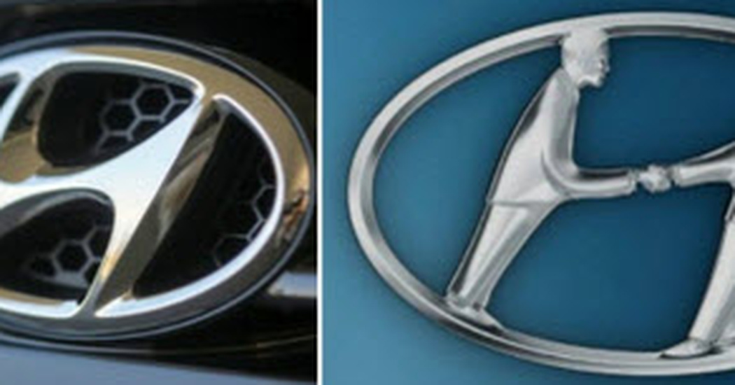
Hyundai
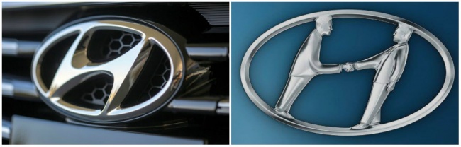
The H in this logo is actually a symbol for two people shaking hands. It stands for a client and a representative of the company.
Adidas
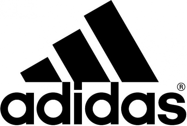
The founder of Adidas, Adolf Dassler, is where the name comes from but the logo has changed over time. Three stripes are always a part of it, however, and the current configuration symbolizes a mountain and the challenges that sportsmen must face.
Apple
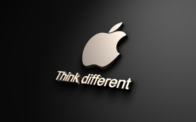
The designer who came up with the Apple logo has given an explanation of how he came up with the idea. ‘I bought a whole bag of apples, placed them in a bowl, and spent time drawing them for a week, trying to break the image down into something simple. Taking a bite out of an apple was part of the experiment, and completely by coincidence I realised that ’bite’ sounded exactly the same as the computer term ’byte’.
Sony Vaio
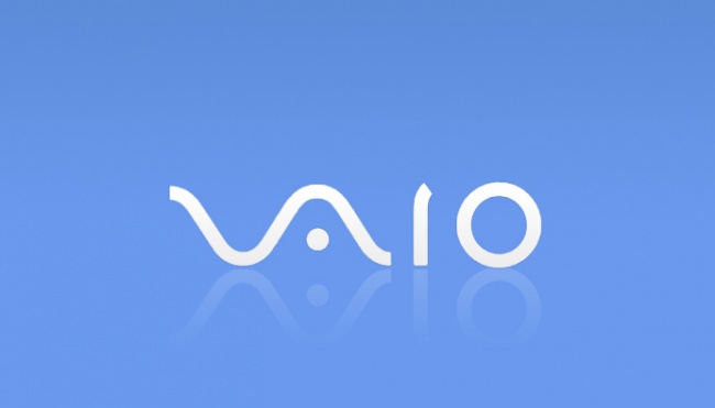
The wave from the first two letters in this logo symbolize the analog symbol. The last two letters represent 1 and 0, symbols of a digital signal.
Amazon.com

We may not give this logo much thought but it was designed with something specific in mind. The orange arrow is not only shaped like a smile, it stretches from the letter A of the Z, showing that they have every product imaginable.
Baskin-Robbins
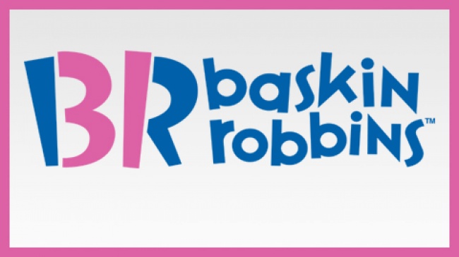
The pink parts of the BR make up the number 31, which is the number of different flavours of ice cream they sell
Toyota
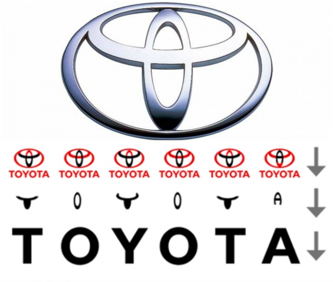
Some people may consider this logo to be like a cowboy wearing a hat, but it actually represents every letter in the name “Toyota”
Continental
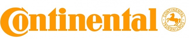
The first two letters form a steering wheel
Formula One
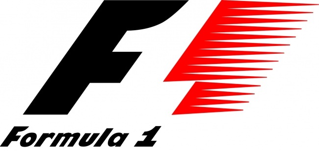
If you look at the white space between the black calf and the red stripes, you can see a number one
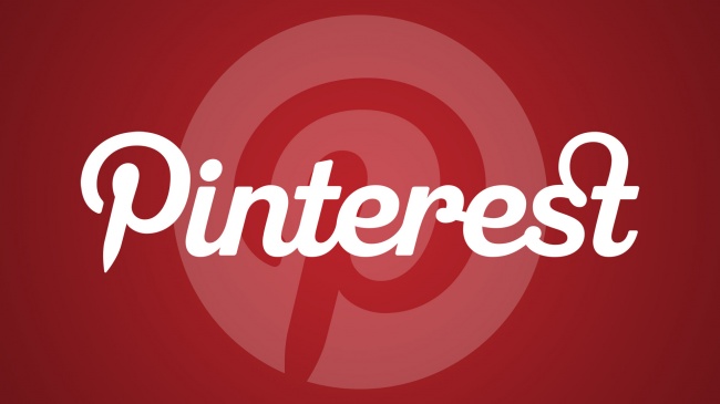
There is a hidden pin in the P of this logo
Beats
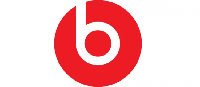
They produce audio equipment and they use the logo with the B, which looks like somebody wearing headphones
Toblerone
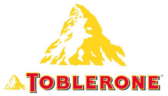
There is a bear hidden in the logo. The company is based in Bern, Switzerland, sometimes referred to as the city of bears.
BMW
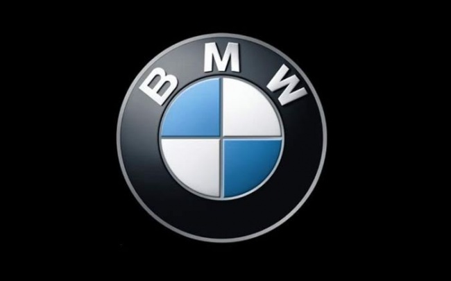
The central part of the BMW logo is sometimes thought to symbolize the rotating parts of an airplane blade. Their early history included aviation technology. The real reason it looks as it does is because it is a part of the Bavarian flag, the part of Germany where they originated.
LG
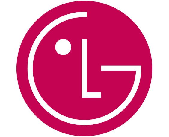
This logo is designed as a person’s face, meant to represent human relations with their customers and the aspiration to maintain ordinary
Evernote
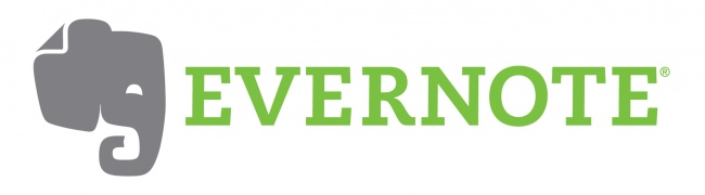
Have you ever heard the expression, an elephant never forget? Evernote never forgets either!
Coca-Cola
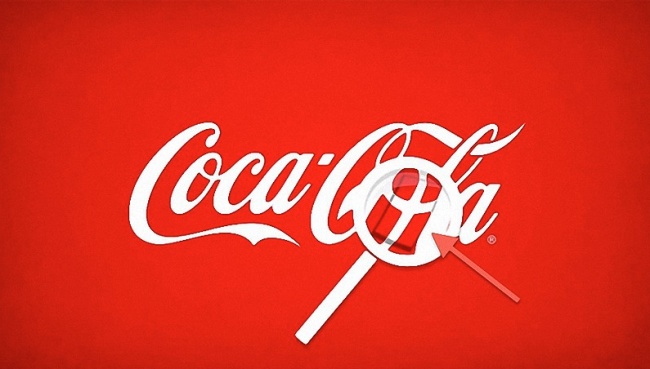
The space between the O and L contains the Danish flag. It is a coincidence but they have used it to market themselves in that Scandinavian country.
Via: Bright Side
Be sure to share this with your friends on Facebook